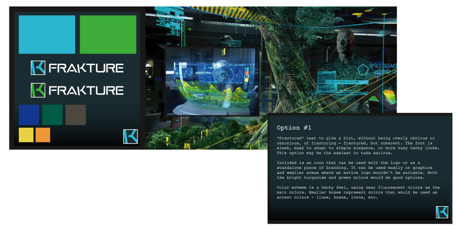
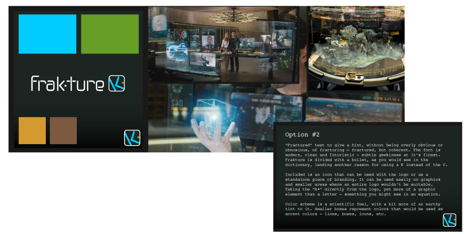
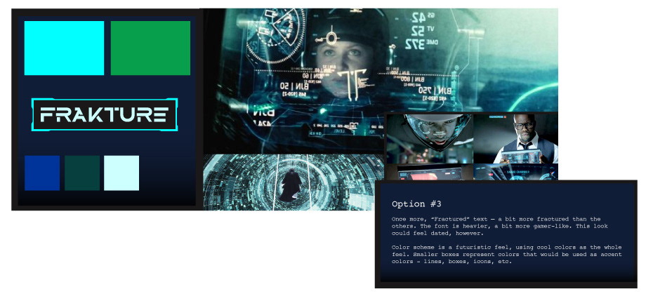
Every strong brand begins with thoughtful exploration. For this project, I guided the branding journey from early concept to visual identity by first gathering the client’s ambitions and preferences. I crafted inspiration boards featuring varied color palettes and logo iterations—each with detailed notes on how subtle mood shifts and color choices influenced perception.
After refining the visual direction, I developed complementary typographic style explorations, helping to showcase how font choices shape tone, readability, and brand personality. This process—layered, considered, and rooted in strategy—establishes a flexible visual language that can be scaled across all brand touchpoints.
Below, you'll find a curated glimpse into that creative progression: inspiration boards paired with logo variations and font studies that demonstrate how intentional visual decisions emerge from creative exploration.